pyecharts示例图
渲染图片文件方法
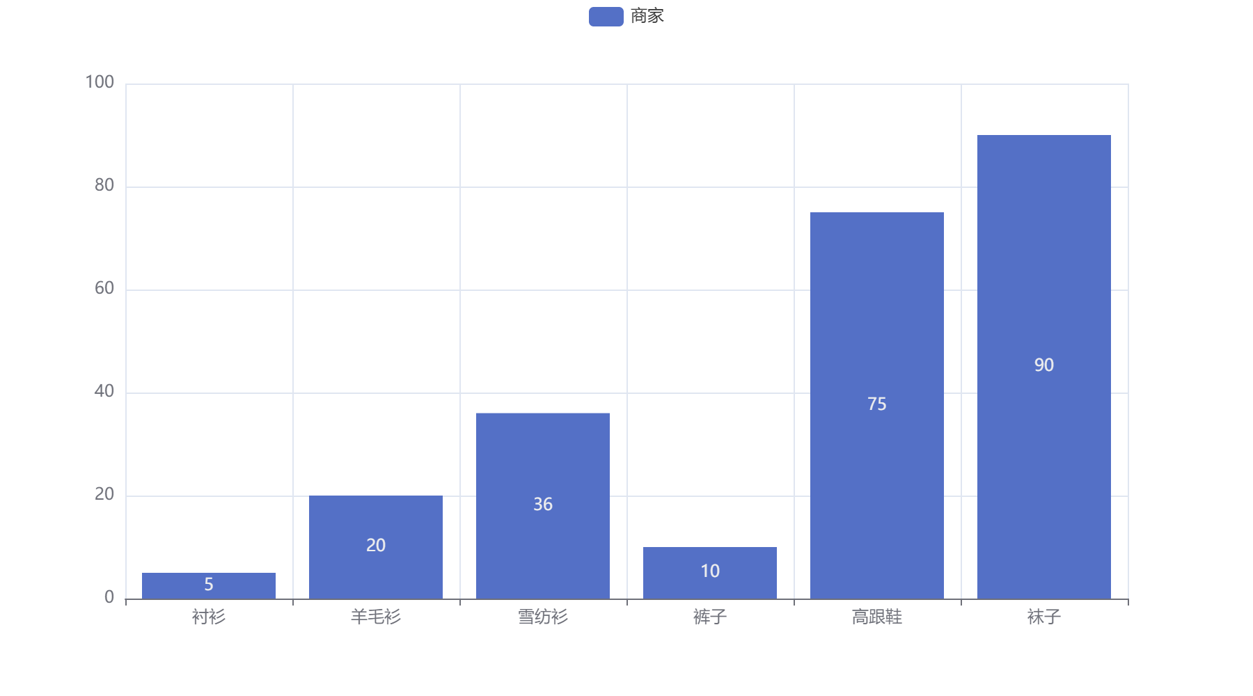
1
2
3
4
5
6
7
8
9
from pyecharts.render import make_snapshot
from snapshot_selenium import snapshot

bar = (
    Bar()
    .add_xaxis(["衬衫", "羊毛衫", "雪纺衫", "裤子", "高跟鞋", "袜子"])
    .add_yaxis('商家',[5, 20, 36, 10, 75, 90])
)
make_snapshot(snapshot,bar.render(),'bar.png')
柱状图
1
2
from pyecharts.globals import CurrentConfig, NotebookType
CurrentConfig.NOTEBOOK_TYPE = NotebookType.JUPYTER_LAB
1
2
3
4
5
from pyecharts.charts import Bar
bar = Bar()
bar.add_xaxis(["衬衫", "羊毛衫", "雪纺衫", "裤子", "高跟鞋", "袜子"])
bar.add_yaxis('商家',[5, 20, 36, 10, 75, 90])
bar.load_javascript()
1
bar.render_notebook()
饼图
1
2
3
from pyecharts.charts import Pie
import pyecharts.options as opts
from pyecharts.faker import Faker
1
list(zip(Faker.choose(),Faker.values()))
1
2
3
4
5
6
7
[('河马', 139),
 ('蟒蛇', 41),
 ('老虎', 100),
 ('大象', 121),
 ('兔子', 80),
 ('熊猫', 47),
 ('狮子', 147)]
1
2
3
c = Pie()
c.add('',[list(x) for x in zip(Faker.choose(),Faker.values())])
c.render_notebook()
1
2
3
4
5
6
7
8
9
10
11
12
13
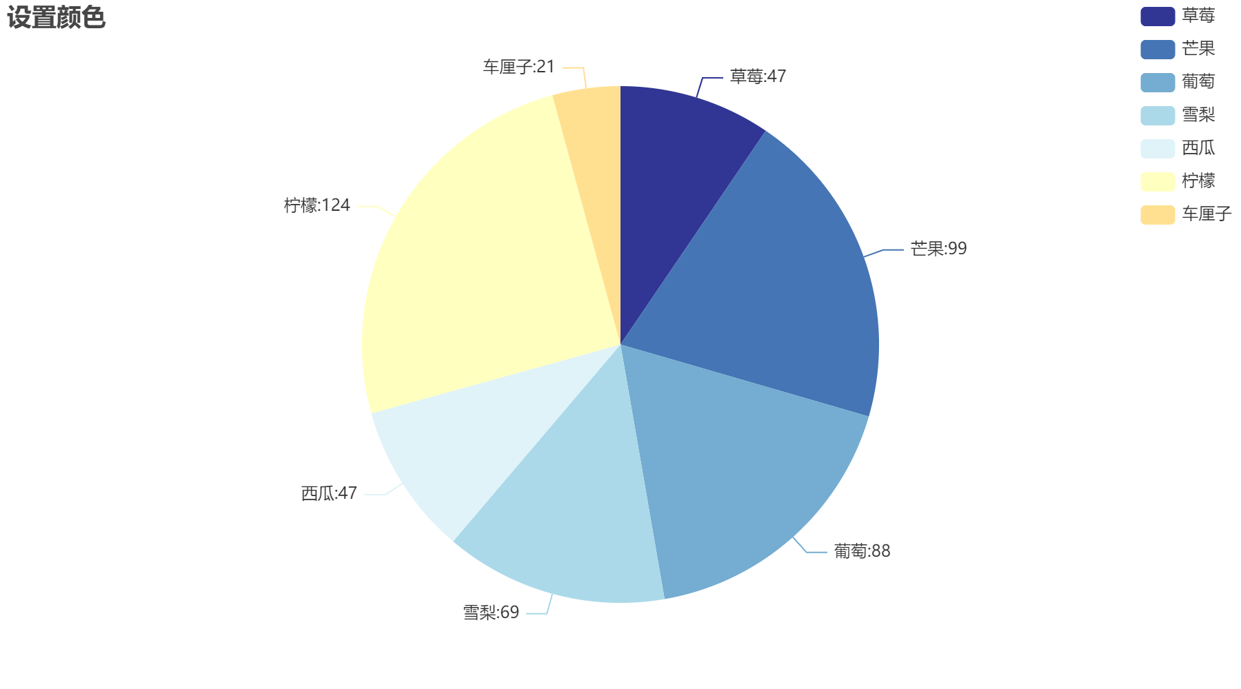
c = (
Pie()
.add('数量',[list(x) for x in zip(Faker.choose(),Faker.values())])
.set_colors(['#313695','#4575b4','#74add1','#abd9e9','#e0f3f8','#ffffbf','#fee090',])
.set_global_opts(
title_opts=opts.TitleOpts(title='设置颜色',pos_top=0,pos_left=0),
legend_opts=opts.LegendOpts(type_='scroll',pos_right=0,orient='vertical')
)
.set_series_opts(
label_opts=opts.LabelOpts(formatter="{b}:{c}"),
)
)
c.render_notebook()
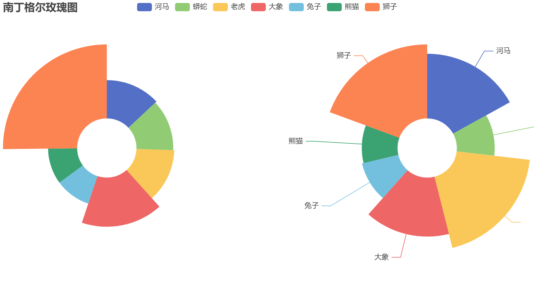
玫瑰图
1
2
v = Faker.choose()
v
1
['河马', '蟒蛇', '老虎', '大象', '兔子', '熊猫', '狮子']
1
2
3
4
5
6
7
8
9
10
11
12
13
14
15
16
17
18
19
20
21
c = (
    Pie()
    .add(
        '',
        [list(i) for i in zip(v,Faker.values())],
        radius=['20%','70%'],
        center=['20%','50%'],
        rosetype='radius',
        label_opts=opts.LabelOpts(is_show=False)
    )
    .add(
        '',
        [list(i) for i in zip(v,Faker.values())],
        radius=['20%','70%'],
        center=['80%','50%'],
        rosetype='radius',
        label_opts=opts.LabelOpts(is_show=True)
    )
    .set_global_opts(title_opts=opts.TitleOpts(title='南丁格尔玫瑰图'))
)
c.render_notebook()
柱形图
1
from pyecharts.charts import Bar
1
2
3
4
5
6
7
8
9
10
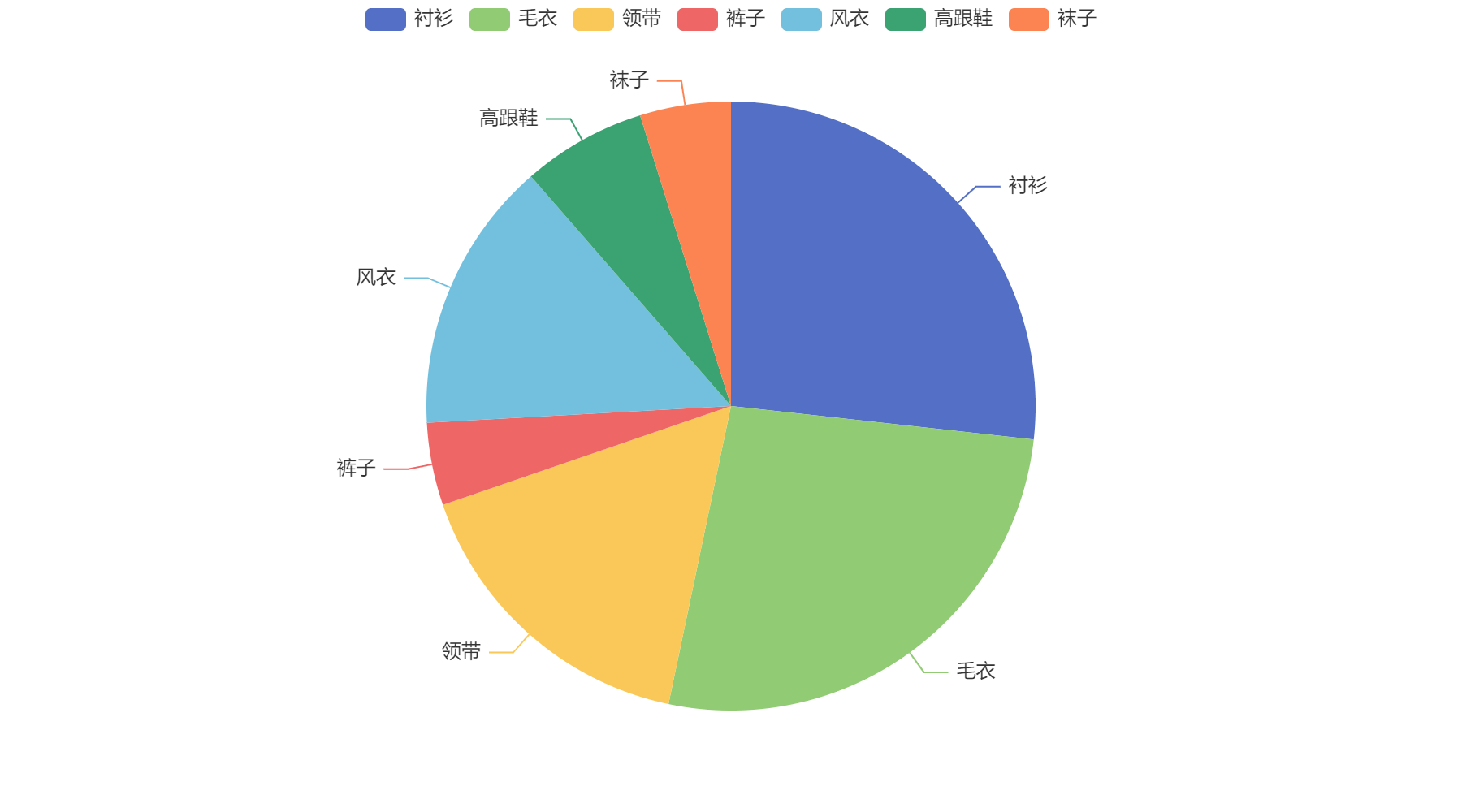
c=(
Bar()
.add_xaxis(Faker.choose())
.add_yaxis('商家A',Faker.values())
.add_yaxis('商家B',Faker.values())
.set_global_opts(
title_opts=opts.TitleOpts(title='销量',subtitle='副标题')
)
)
c.render_notebook()

1
2
3
4
5
6
7
8
9
10
11
12
13
14
15
16
17
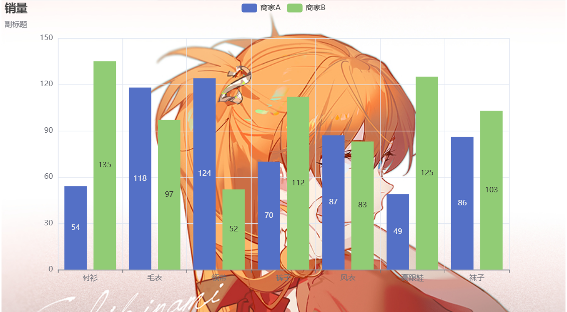
c=(
Bar(
init_opts=opts.InitOpts(
animation_opts=opts.AnimationOpts(
animation_delay=100, #延时动画1000ms
animation_easing='elasticOut' #弹性动画
)
)
)
.add_xaxis(Faker.choose())
.add_yaxis('商家A',Faker.values())
.add_yaxis('商家B',Faker.values())
.set_global_opts(
title_opts=opts.TitleOpts(title='销量',subtitle='副标题'),
)
)
c.render_notebook()
执行JS代码
1
from pyecharts.commons.utils import JsCode
1
2
3
4
5
6
7
8
9
10
11
12
13
14
15
16
17
18
19
20
21
22
23
24
c=(
    Bar(
        init_opts=opts.InitOpts(
            bg_color={
                'image' :JsCode('img'),
            }
        )
    )
    .add_xaxis(Faker.choose())
    .add_yaxis('商家A',Faker.values())
    .add_yaxis('商家B',Faker.values())
    .set_global_opts(
        title_opts=opts.TitleOpts(title='销量',subtitle='副标题'),
    )
)

#添加js代码
c.add_js_funcs(
    """
    var img = new Image();
    img.src = "http://localhost:8888/files/pyecharts/%E3%81%82%E3%81%99%E3%81%8B.jpg?_xsrf=2%7C2b50c939%7Cd7ba3194aadfcc7497a9007df4693a2c%7C1722234893"
    """
)
c.render_notebook()
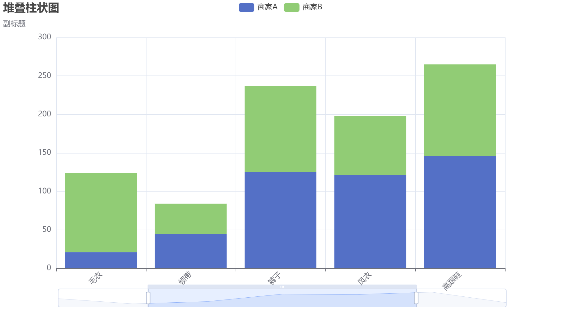
堆叠柱状图
1
2
3
4
5
6
7
8
9
10
11
12
13
14
15
16
17
18
19
20
21
22
23
c=(
    Bar()
    .add_xaxis(Faker.choose())
    .add_yaxis('商家A',Faker.values(),stack='abc')
    .add_yaxis('商家B',Faker.values(),stack='abc')
    .set_series_opts(
        label_opts=opts.LabelOpts(is_show=False)
    )
    .set_global_opts(
        title_opts=opts.TitleOpts(title='堆叠柱状图',subtitle='副标题'),
        xaxis_opts=opts.AxisOpts(
            axislabel_opts=opts.LabelOpts(rotate=45)
        ),
        #缩放
        datazoom_opts=[
            opts.DataZoomOpts(),  #x轴拖拉缩放
            opts.DataZoomOpts(type_='inside') #滚轮缩放
        ]

    )
)

c.render_notebook()
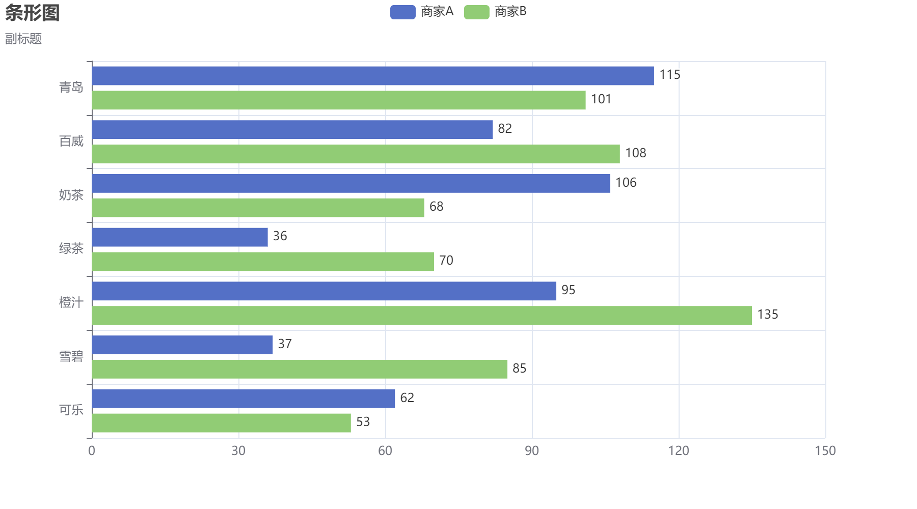
条形图
1
2
3
4
5
6
7
8
9
10
11
12
13
14
15
c=(
    Bar()
    .add_xaxis(Faker.choose())
    .add_yaxis('商家A',Faker.values())
    .add_yaxis('商家B',Faker.values())
    .reversal_axis()  #反转轴
    .set_series_opts(
        label_opts=opts.LabelOpts(is_show=True,position='right')
    )
    .set_global_opts(
        title_opts=opts.TitleOpts(title='条形图',subtitle='副标题'),
    )
)

c.render_notebook()
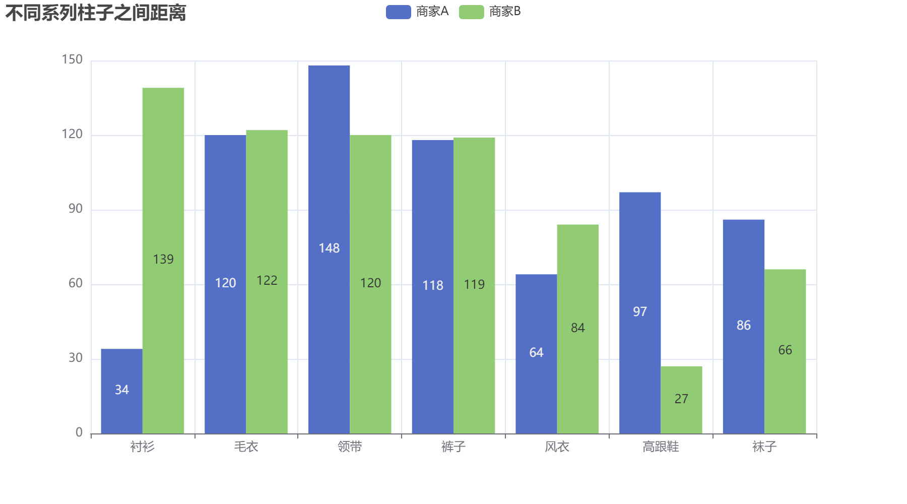
直方图
不同系列柱子之间的距离
1
2
3
4
5
6
7
8
9
10
11
c=(
    Bar()
    .add_xaxis(Faker.choose())
    .add_yaxis('商家A',Faker.values(),gap='0%')
    .add_yaxis('商家B',Faker.values(),gap='0%')
    .set_global_opts(
        title_opts=opts.TitleOpts(title='不同系列柱子之间距离'),
    )
)

c.render_notebook()
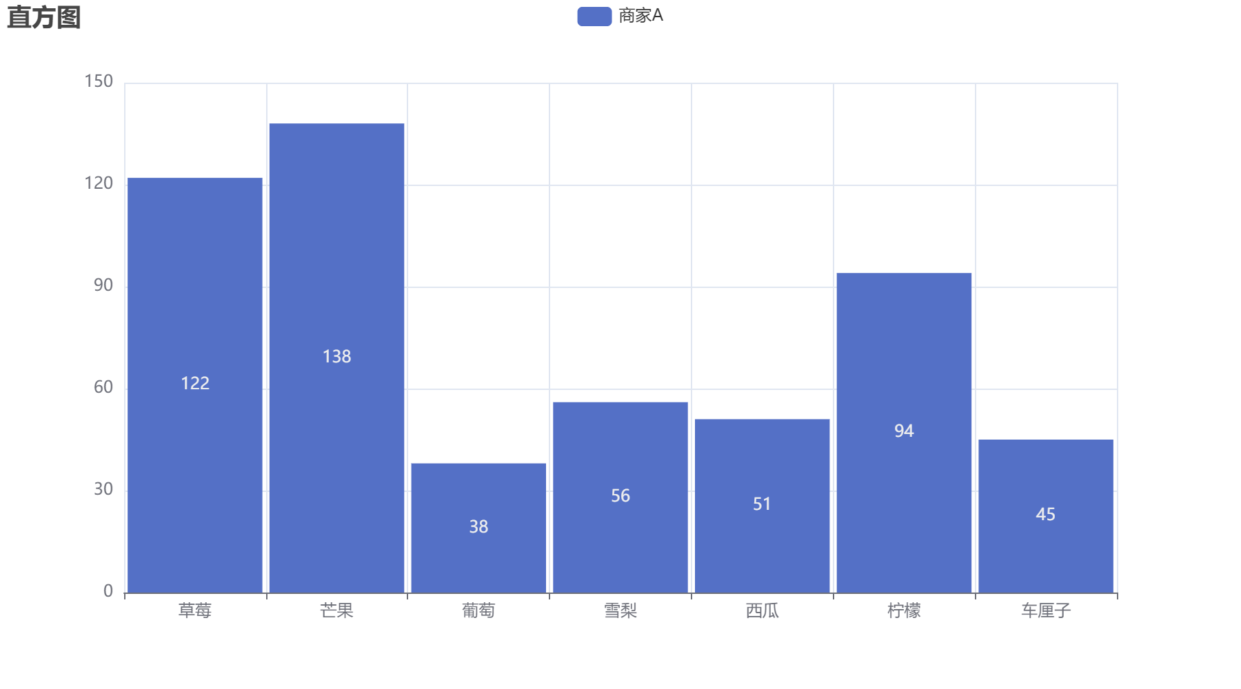
单系列柱子之间的间距
1
2
3
4
5
6
7
8
9
10
c=(
    Bar()
    .add_xaxis(Faker.choose())
    .add_yaxis('商家A',Faker.values(),category_gap='5%')
    .set_global_opts(
        title_opts=opts.TitleOpts(title='直方图'),
    )
)

c.render_notebook()
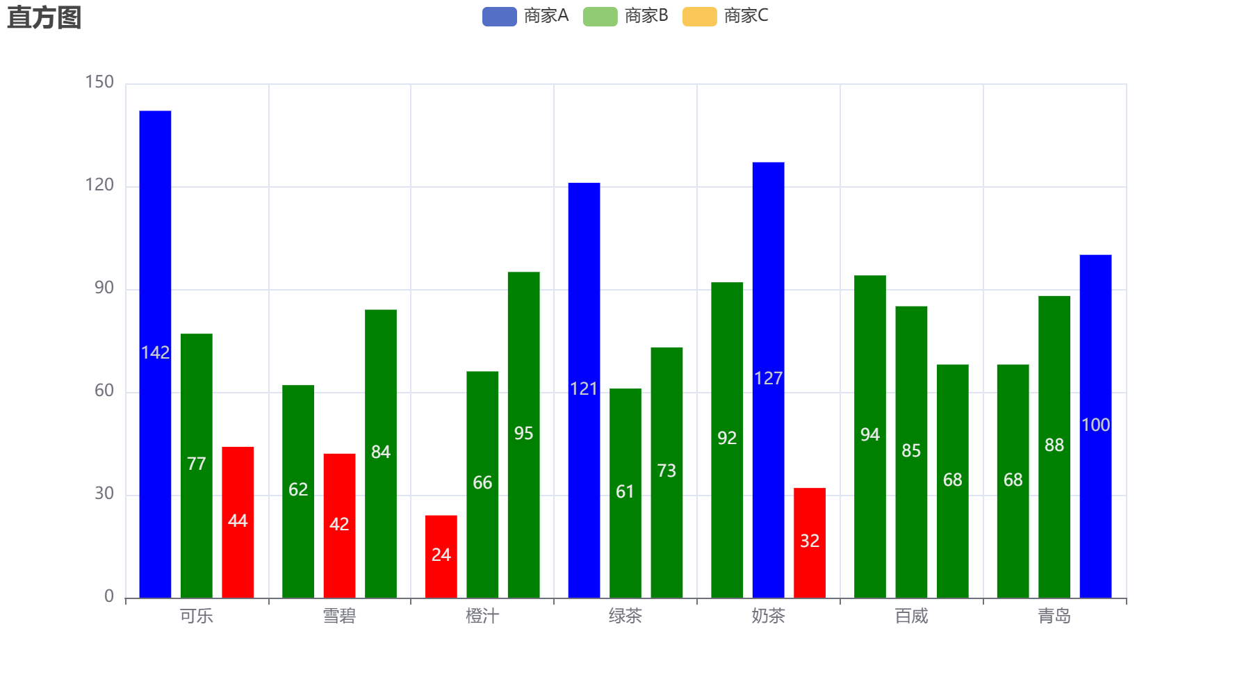
JsCode自定义柱颜色
1
2
3
4
5
6
7
8
9
10
11
12
13
14
15
16
17
18
19
20
21
22
23
24
25
26
27
28
29
30
31
32
33
34
35
36
color_func="""
        function (params){
            if (params.value > 0 && params.value < 50){
                return 'red';
            }
            else if (params.value > 50 && params.value < 100){
                return 'green';
            }
            return 'blue';
        }
"""

c=(
    Bar()
    .add_xaxis(Faker.choose())
    .add_yaxis(
        '商家A',Faker.values(),
        itemstyle_opts=opts.ItemStyleOpts(color=JsCode(color_func)),

    )
    .add_yaxis(
        '商家B',Faker.values(),
        itemstyle_opts=opts.ItemStyleOpts(color=JsCode(color_func)),

    )
    .add_yaxis(
        '商家C',Faker.values(),
        itemstyle_opts=opts.ItemStyleOpts(color=JsCode(color_func)),

    )
    .set_global_opts(
        title_opts=opts.TitleOpts(title='直方图'),
    )
)

c.render_notebook()
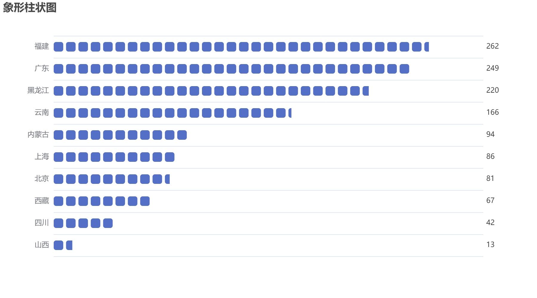
象形柱状图
1
2
from pyecharts.charts import PictorialBar
from pyecharts.globals import SymbolType
1
2
3
4
5
6
7
8
9
10
11
12
13
14
15
16
17
18
19
20
21
22
23
24
25
26
27
28
location = ['山西','四川','西藏','北京','上海','内蒙古','云南','黑龙江','广东','福建']
values = [13,42,67,81,86,94,166,220,249,262]
c = (
    PictorialBar()
    .add_xaxis(location)
    .add_yaxis(
        '',
        values,
        label_opts=opts.LabelOpts(is_show=True),
        symbol_repeat='fixed', #重复方式
        symbol=SymbolType.ROUND_RECT, #象形符号类型
        symbol_size=16, #符号裁剪
        is_symbol_clip=True
    )
    .reversal_axis()
    .set_global_opts(
        title_opts=opts.TitleOpts(title='象形柱状图'),
        xaxis_opts=opts.AxisOpts(is_show=False), #不显示x轴
        yaxis_opts=opts.AxisOpts(
            axistick_opts=opts.AxisTickOpts(is_show=False), #不显示y轴刻度
            axisline_opts=opts.AxisLineOpts(is_show=False)
        ),
    )
    .set_series_opts(
        label_opts=opts.LabelOpts(position='right')
    )
)
c.render_notebook()
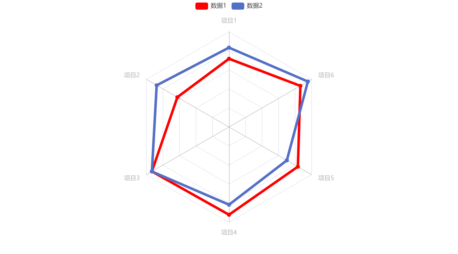
雷达图
1
from pyecharts.charts import Radar
1
2
v1 = [[4300,10000,28000,35000,50000,19000]]
v2 = [[5000,14000,28000,31000,42000,21000]]
1
2
3
4
5
6
7
8
9
10
11
12
13
14
15
16
17
18
19
20
21
c=(
    Radar()
    .add_schema(
        schema=[
            opts.RadarIndicatorItem(name='项目1',max_=6000),
            opts.RadarIndicatorItem(name='项目2',max_=16000),
            opts.RadarIndicatorItem(name='项目3',max_=30000),
            opts.RadarIndicatorItem(name='项目4',max_=38000),
            opts.RadarIndicatorItem(name='项目5',max_=60000),
            opts.RadarIndicatorItem(name='项目6',max_=22000)
        ]
    )
    .add('数据1',v1,color='red')
    .add('数据2',v2)
    .set_series_opts(
        label_opts=opts.LabelOpts(is_show=False),
        linestyle_opts=opts.LineStyleOpts(width=5)
    )
)

c.render_notebook()
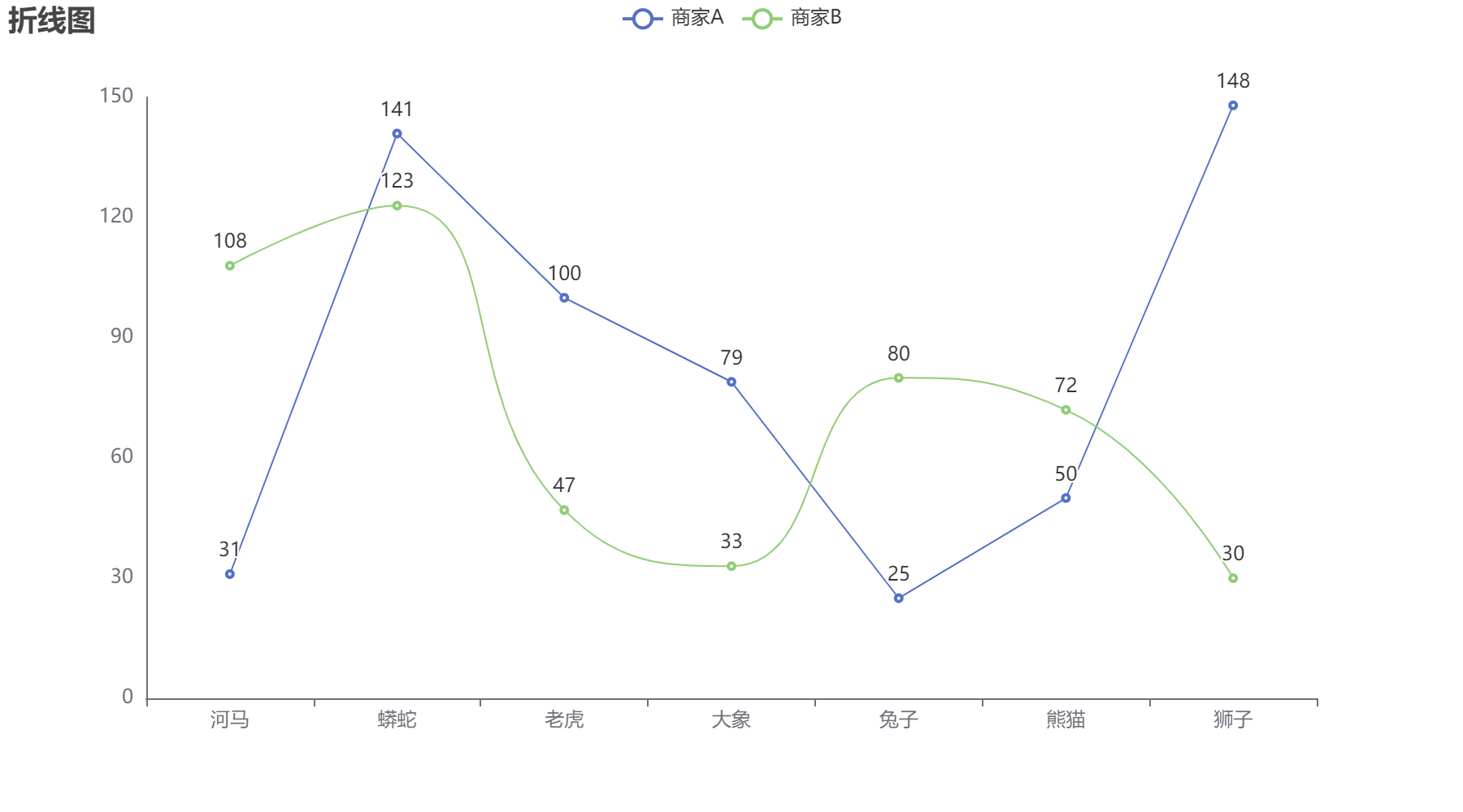
折线图
1
from pyecharts.charts import Line
1
2
3
4
5
6
7
8
9
10
11
12
13
14
15
16
17
18
19
20
21
22
23
24
25
c=(
    Line()
    .add_xaxis(Faker.choose())
    .add_yaxis('商家A',Faker.values())
    .add_yaxis('商家B',Faker.values(),is_smooth=True)  #平滑曲线
    .set_global_opts(
        title_opts=opts.TitleOpts(
            title='折线图'
        ),
        tooltip_opts=opts.TooltipOpts(
            trigger='axis'
        ),
        yaxis_opts=opts.AxisOpts(
            splitline_opts=opts.SplitLineOpts(is_show=False),
            is_show=True,
            axisline_opts=opts.AxisLineOpts(
                is_show=True
            )
        ),
        xaxis_opts=opts.AxisOpts(
            splitline_opts=opts.SplitLineOpts(is_show=False)
        ),
    )
)
c.render_notebook()
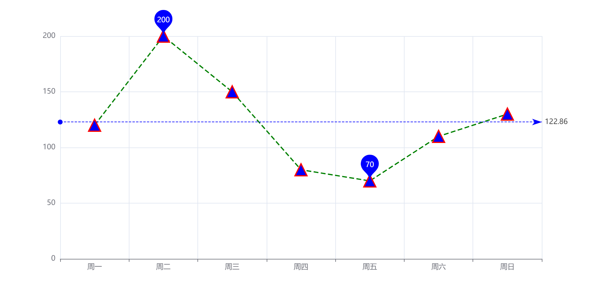
1
2
3
4
5
6
7
8
9
10
11
12
13
14
15
16
17
18
19
20
21
22
23
24
25
26
27
28
29
30
31
32
33
34
35
36
37
38
39
40
41
42
43
c=(
    Line(init_opts=opts.InitOpts(width='1000px',height='500px'))
    .add_xaxis(xaxis_data=Faker.week)
    .add_yaxis(
        series_name='',
        y_axis=[120,200,150,80,70,110,130],
        symbol='triangle', #点类型
        symbol_size=20,
        #线条样式
        linestyle_opts=opts.LineStyleOpts(
            color='green',
            width=2,
            type_='dashed',

        ),
        label_opts=opts.LabelOpts(is_show=False),
        itemstyle_opts=opts.ItemStyleOpts(
            border_width=2,border_color='red',color='blue'
        ),
        markpoint_opts=opts.MarkPointOpts(
            data=[
                opts.MarkPointItem(type_='max'),
                opts.MarkPointItem(type_='min')
            ]
        ),
        markline_opts=opts.MarkLineOpts(
            data=[
                opts.MarkLineItem(type_='average')
            ],
        )
    )
    .set_global_opts(
        yaxis_opts=opts.AxisOpts(
            type_='value',
            splitline_opts=opts.SplitLineOpts(
                is_show=True
            )
        ),
        tooltip_opts=opts.TooltipOpts(trigger='axis')
    )
)

c.render_notebook()
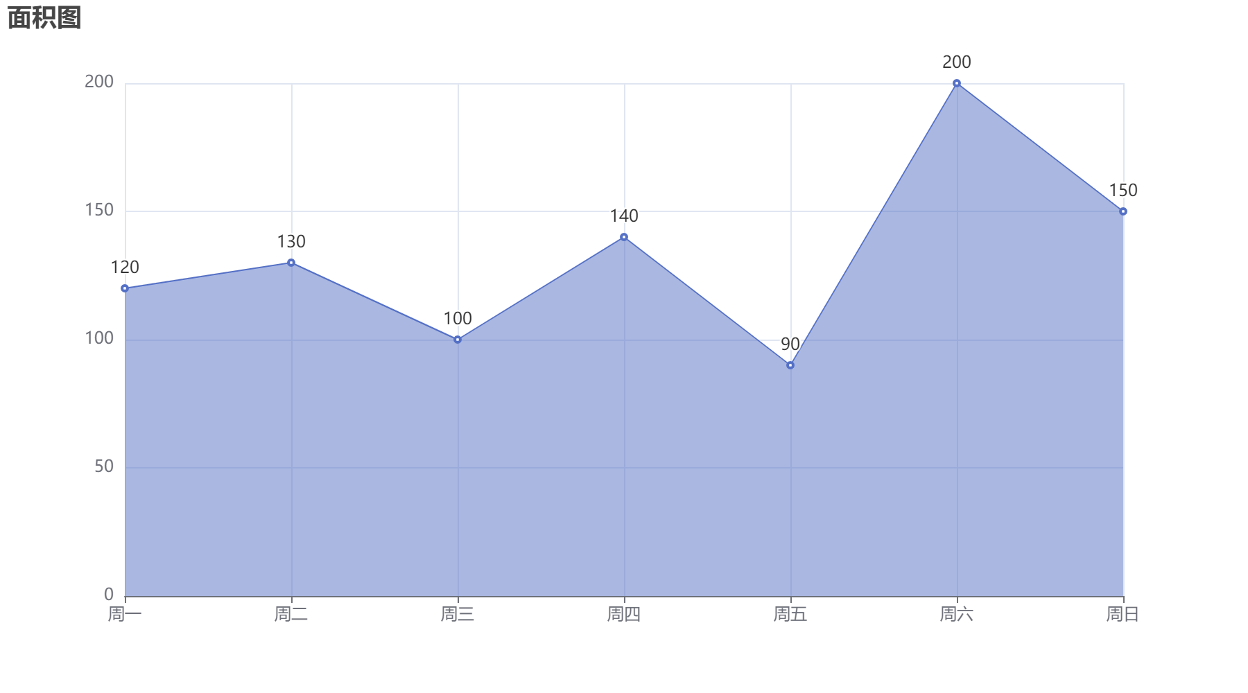
面积图
1
2
3
4
5
6
7
8
9
10
11
12
13
14
15
16
c=(
    Line()
    .add_xaxis(Faker.week)
    .add_yaxis(
        '',
        y_axis=[120,130,100,140,90,200,150],
        areastyle_opts=opts.AreaStyleOpts(opacity=0.5)
    )
    .set_global_opts(
        title_opts=opts.TitleOpts(title='面积图'),
        tooltip_opts=opts.TooltipOpts(trigger='axis'),
        xaxis_opts=opts.AxisOpts(type_='category',boundary_gap=False)
    )
)

c.render_notebook()
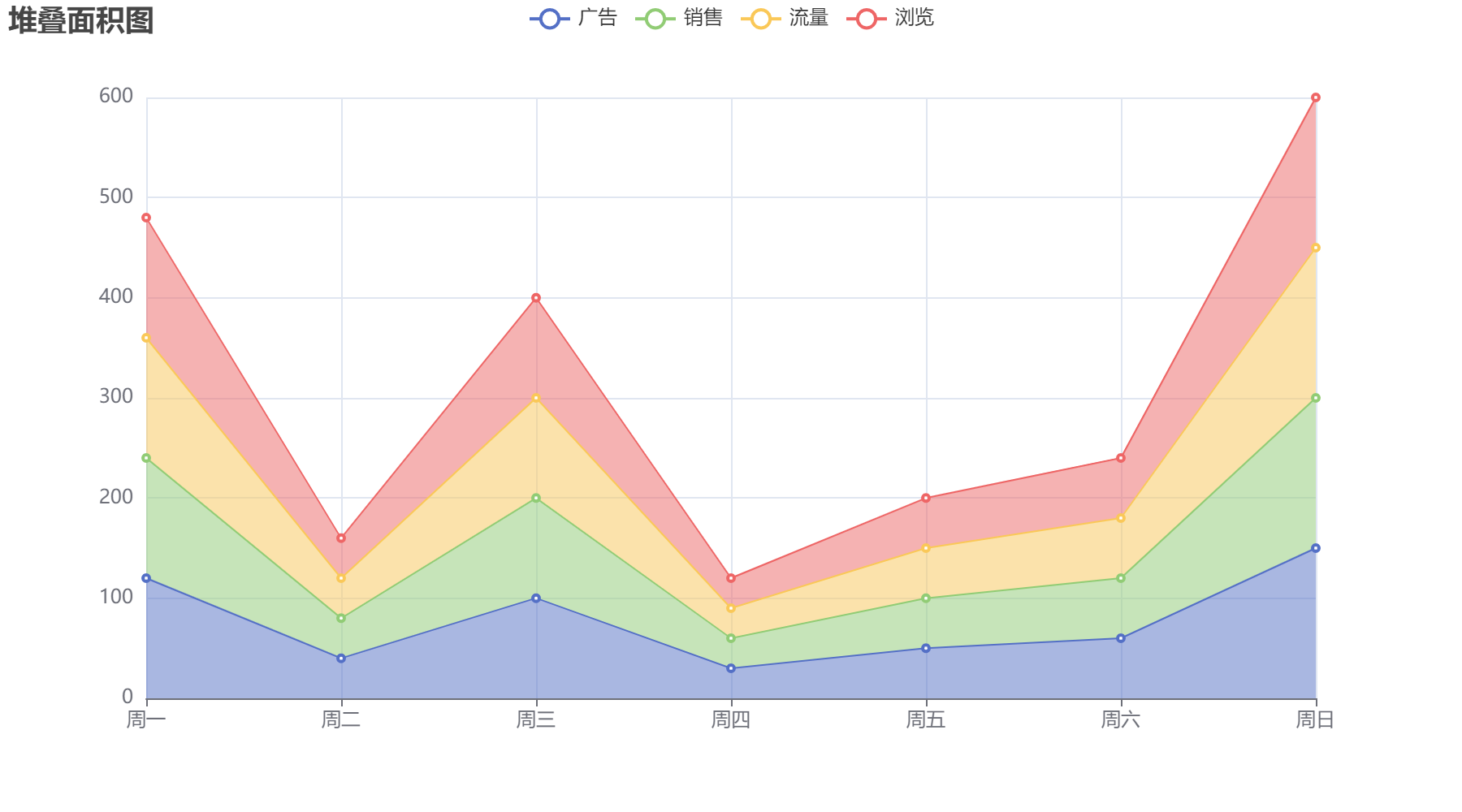
堆叠面积图
1
2
3
4
5
6
7
8
9
10
11
12
13
14
15
16
17
18
19
20
21
22
23
24
25
26
27
28
29
30
31
32
33
34
35
36
37
c=(
    Line()
    .add_xaxis(Faker.week,)
    .add_yaxis(
        '广告',
        stack='堆叠',
        y_axis=[120,40,100,30,50,60,150],
        areastyle_opts=opts.AreaStyleOpts(opacity=0.5),
        label_opts=opts.LabelOpts(is_show=False)
    )
    .add_yaxis(
        '销售',
        stack='堆叠',
        y_axis=[120,40,100,30,50,60,150],
        areastyle_opts=opts.AreaStyleOpts(opacity=0.5),
        label_opts=opts.LabelOpts(is_show=False)
    )
    .add_yaxis(
        '流量',
        stack='堆叠',
        y_axis=[120,40,100,30,50,60,150],
        areastyle_opts=opts.AreaStyleOpts(opacity=0.5),
        label_opts=opts.LabelOpts(is_show=False)
    )
    .add_yaxis(
        '浏览',
        stack='堆叠',
        y_axis=[120,40,100,30,50,60,150],
        areastyle_opts=opts.AreaStyleOpts(opacity=0.5),
        label_opts=opts.LabelOpts(is_show=False)
    )
    .set_global_opts(
        title_opts=opts.TitleOpts(title='堆叠面积图'),
        xaxis_opts=opts.AxisOpts(type_='category',boundary_gap=False)
    )
)
c.render_notebook()
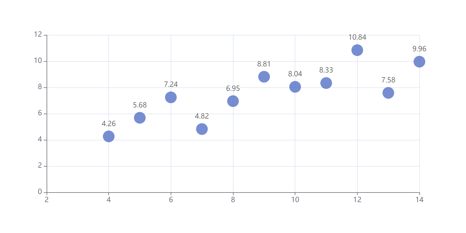
散点图
1
from pyecharts.charts import Scatter
1
2
3
4
5
6
7
8
9
10
11
12
13
data=[
    [10.0,8.04],
    [8.0,6.95],
    [13.0,7.58],
    [9.0,8.81],
    [11.0,8.33],
    [14.0,9.96],
    [6.0,7.24],
    [4.0,4.26],
    [12.0,10.84],
    [7.0,4.82],
    [5.0,5.68]
]
1
data.sort(key=lambda x: x[0])
1
2
3
x_data = [d[0] for d in data]
y_data = [d[1] for d in data]
display(x_data,y_data)
1
2
3
4
5
[4.0, 5.0, 6.0, 7.0, 8.0, 9.0, 10.0, 11.0, 12.0, 13.0, 14.0]


[4.26, 5.68, 7.24, 4.82, 6.95, 8.81, 8.04, 8.33, 10.84, 7.58, 9.96]
1
2
3
4
5
6
7
8
9
10
11
12
13
14
15
16
17
18
19
20
c=(
    Scatter(
        init_opts=opts.InitOpts(width='800px',height='400px')
    )
    .add_xaxis(xaxis_data=x_data)
    .add_yaxis(
        '',
        y_axis=y_data,
        symbol_size=20,
        label_opts=opts.LabelOpts(is_show=True,position='top')
    )
    .set_global_opts(
        xaxis_opts=opts.AxisOpts(
            min_=2,
            type_='value',

        )
    )
)
c.render_notebook()
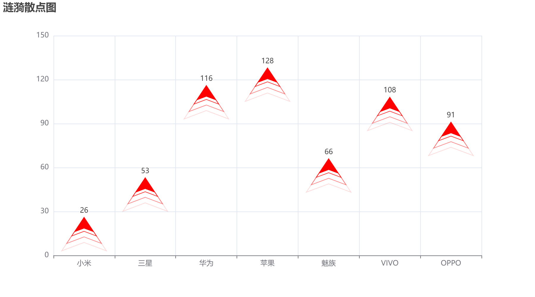
涟漪散点图
1
2
from pyecharts.charts import EffectScatter
from pyecharts.globals import SymbolType
1
2
3
4
5
6
7
8
9
10
11
12
13
14
15
16
c=(
    EffectScatter()
    .add_xaxis(Faker.choose())
    .add_yaxis(
        '',
        Faker.values(),
        symbol=SymbolType.ARROW,
        symbol_size=25,
        color='red',
        label_opts=opts.LabelOpts(position='top')
    )
    .set_global_opts(
        title_opts=opts.TitleOpts(title='涟漪散点图'),
    )
)
c.render_notebook()
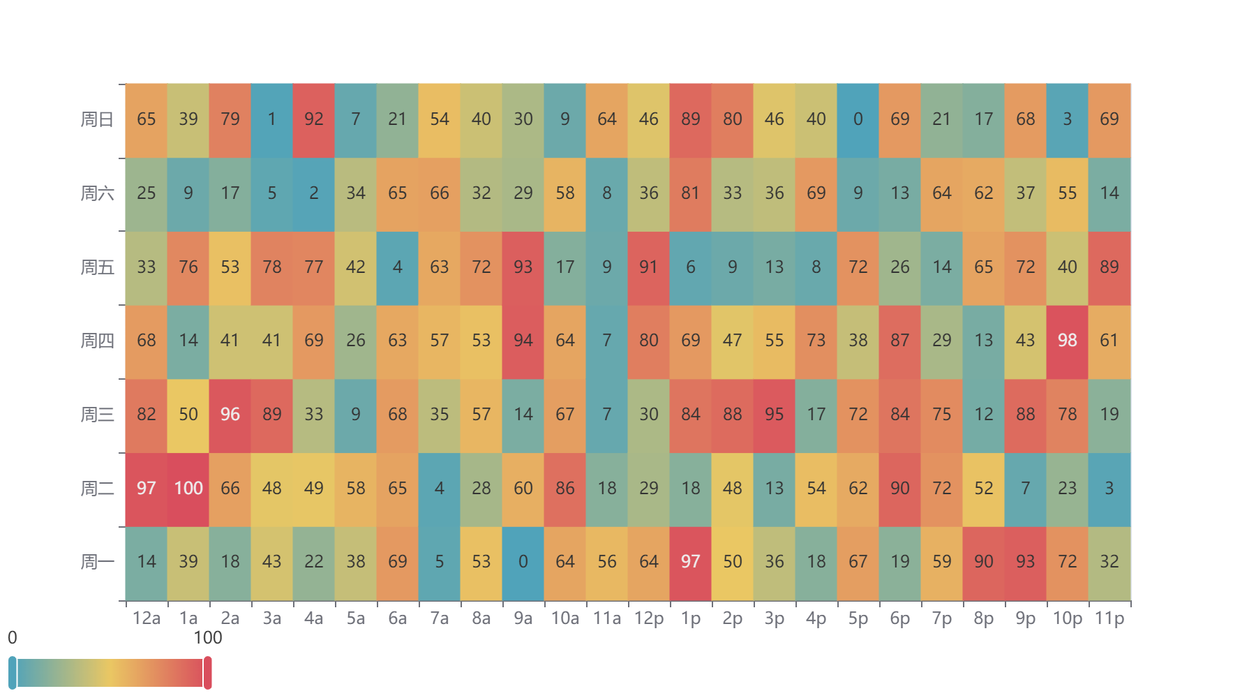
热力图
1
2
from pyecharts.charts import HeatMap
import random
1
value = [[i,j,random.randint(0,100)] for i in range(24) for j in range(7)]
1
2
3
4
5
6
7
8
9
10
11
c=(
    HeatMap()
    .add_xaxis(Faker.clock)
    .add_yaxis(
        '',
        Faker.week,
        value,
        label_opts=opts.LabelOpts(color='auto'),
    )
)
c.render_notebook()
日历图
1
2
from pyecharts.charts import Calendar
import datetime
1
2
begin = datetime.date(2023,1,1)
end = datetime.date(2024,1,1)
1
(end-begin).days
1
365
1
2
data = [[str(begin+datetime.timedelta(days=i)),random.randint(1000,25000)]
        for i in range((end-begin).days)]
1
data[0],data[-1]
1
(['2023-01-01', 4652], ['2023-12-31', 15378])
1
2
3
4
5
6
7
8
9
10
11
12
13
14
15
16
17
18
19
20
21
22
23
24
25
c = (
    Calendar(
        init_opts=opts.InitOpts(height='220px')
    )
    .add(
        '',
        data,
        calendar_opts=opts.CalendarOpts(
            range_='2023',
            daylabel_opts=opts.CalendarDayLabelOpts(name_map='cn'),
            monthlabel_opts=opts.CalendarMonthLabelOpts(name_map="cn")
        )
    )
    .set_global_opts(
        visualmap_opts=opts.VisualMapOpts(
            max_=25000,
            min_=1000,
            orient="horizontal",
            is_piecewise=True,
            pos_top="230px",
            pos_left="100px",
        )
    )
)
c.render_notebook()

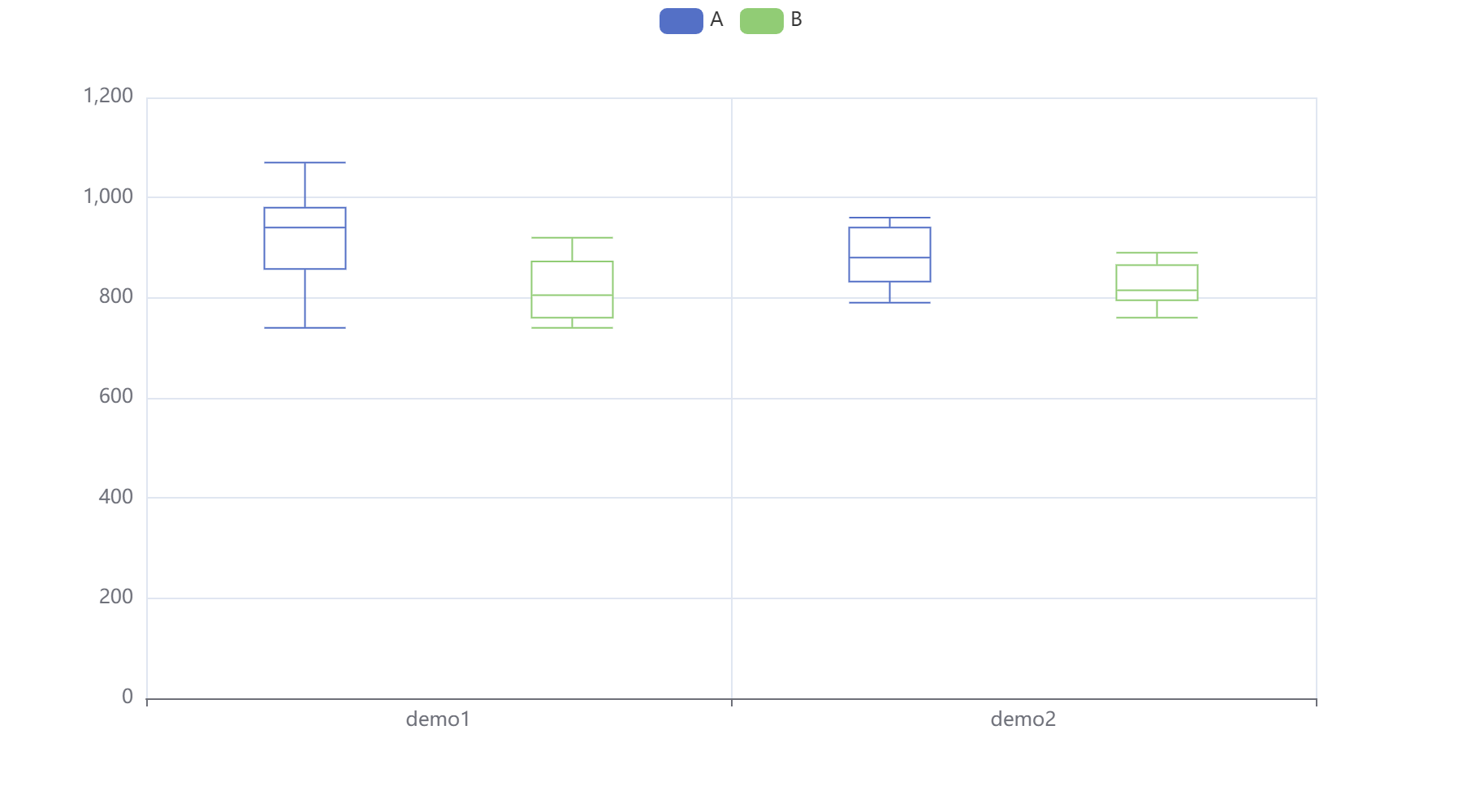
1
from pyecharts.charts import Boxplot
1
2
3
4
5
6
7
8
v1 = [
    [850,740,900,1070,930,850,950,980,980,880,1000,980],
    [960,940,960,940,880,800,850,880,900,840,830,790],
]
v2 = [
    [890,810,810,820,800,770,760,740,750,760,910,920],
    [890,840,780,810,760,810,790,810,820,850,870,870],
]
箱型图
1
2
3
4
5
c=Boxplot()
c.add_xaxis(['demo1','demo2'])
c.add_yaxis('A',c.prepare_data(v1))
c.add_yaxis('B',c.prepare_data(v2))
c.render_notebook()
词云图
1
from pyecharts.charts import WordCloud
1
2
3
4
5
6
# wordcloud = (
#     WordCloud()
#     .add("", data_pair = words, word_size_range=[6,60],textstyle_opts=opts.TextStyleOpts(font_family='Microsoft YaHei',font_weight='bold'))
#     .set_global_opts(title_opts=opts.TitleOpts(title="《政府工作报告(2021)》新词",title_textstyle_opts = opts.TextStyleOpts(font_size = 25,color="midnightblue")))
# )
# wordcloud.render_notebook()
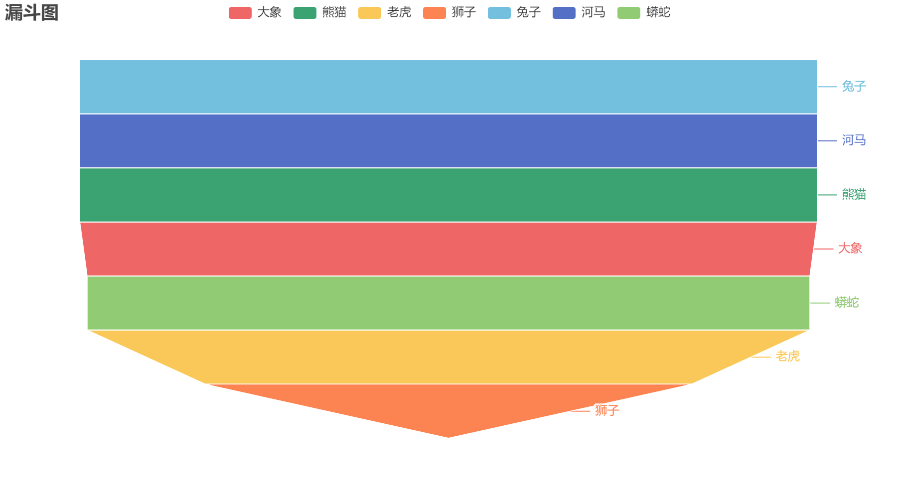
漏斗图
1
from pyecharts.charts import Funnel
1
[list(i) for i in zip(Faker.choose(),Faker.values())]
1
2
3
4
5
6
7
[['小米', 22],
 ['三星', 81],
 ['华为', 54],
 ['苹果', 46],
 ['魅族', 55],
 ['VIVO', 124],
 ['OPPO', 40]]
1
2
3
4
5
6
7
8
c=(
    Funnel()
    .add('商品',[list(i) for i in zip(Faker.choose(),Faker.values())])
    .set_global_opts(
        title_opts=opts.TitleOpts(title='漏斗图')
    )
)
c.render_notebook()
1
2
3
4
x_data=['访问','点击','咨询','加购','下单']
y_data=[100,80,60,40,20]

data=[[x_data[i],y_data[i]] for i in range(len(x_data))]
1
2
3
4
5
6
7
8
9
10
11
12
13
14
15
16
17
18
19
20
21
22
23
c=(
    Funnel(
        init_opts=opts.InitOpts(width='600px',height='400px')
    )
    .add(
        '漏斗图',
        data_pair=data,
        gap=5,
        tooltip_opts=opts.TooltipOpts(
            trigger='item',
            formatter='{a}<br/> {b}:{c}'
        ),
        label_opts=opts.LabelOpts(
            is_show=True,
            position='inside',
            font_size=16
        )
    )
    .set_global_opts(
        title_opts=opts.TitleOpts(title='漏斗图')
    )
)
c.render_notebook()

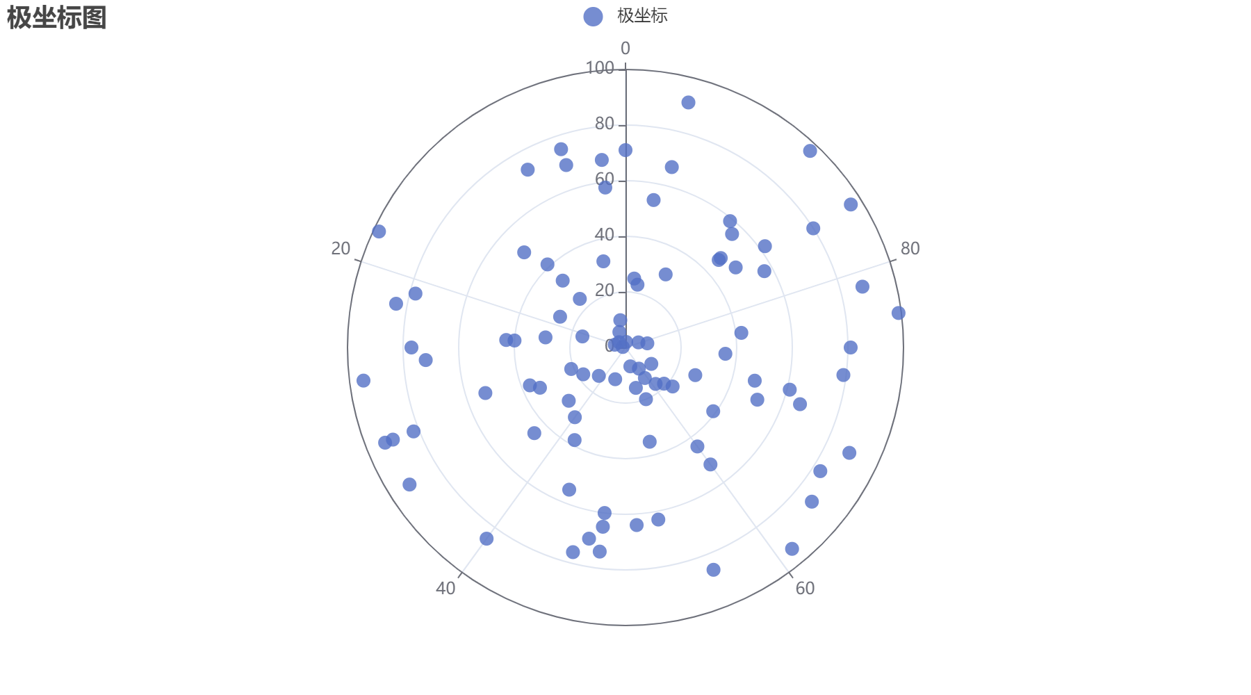
极坐标图
1
from pyecharts.charts import Polar
1
data=[(i,random.randint(1,100)) for i in range(100)]
1
2
3
4
5
6
7
8
9
10
11
12
13
14
15
16
17
18
19
20
21
c=(
    Polar()
    .add(
        '极坐标',
        data,
        type_='scatter',
        label_opts=opts.LabelOpts(
            is_show=False,
        ),
        symbol_size=10
        # effect_opts=opts.EffectOpts(
        #     scale=10
        # )
    )
    .set_global_opts(
        title_opts=opts.TitleOpts(
            title='极坐标图'
        )
    )
)
c.render_notebook()
1
2
3
4
5
6
7
8
9
10
11
12
13
14
15
c=(
    Polar()
    .add_schema(
        radiusaxis_opts=opts.RadiusAxisOpts(
            data=Faker.week,
            type_='category'
        ),
        angleaxis_opts=opts.AngleAxisOpts(
            is_clockwise=True,
            max_=10
        )
    )
    .add('商品',[1,2,3,4,3,5,1],type_='bar')
)
c.render_notebook()
1
2
3
4
5
6
7
8
9
10
11
12
13
14
15
16
17
18
19
20
21
22
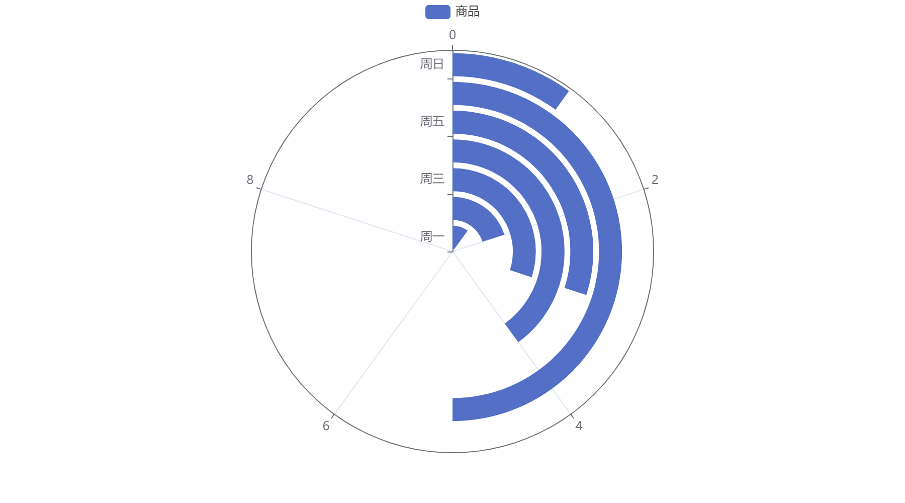
c=(
Polar()
.add_schema(
# radiusaxis_opts=opts.RadiusAxisOpts(
# data=Faker.week,
# type_='category'
# ),
angleaxis_opts=opts.AngleAxisOpts(
data=Faker.week,
type_='category'
)
)
.add('商品A',[1,2,3,4,3,5,1],type_='bar',stack='abc')
.add('商品B',[2,4,3,5,2,3,1],type_='bar',stack='abc')
.add('商品C',[1,2,3,4,3,5,1],type_='bar',stack='abc')
.set_global_opts(
title_opts=opts.TitleOpts(
title='极坐标图+堆叠柱形图'
)
)
)
c.render_notebook()

水球图
1
from pyecharts.charts import Liquid
1
2
3
4
5
6
# c =(
#     Liquid()
#     .add('',[0.2,0.7]) #0.7水百分之七十,0.2显示数值
#     .set_global_opts(title_opts=opts.TitleOpts(title='水球图'))
# )
# c.render_notebook()
桑基图
1
from pyecharts.charts import Sankey
1
2
3
4
5
6
7
8
9
10
11
12
13
14
15
16
17
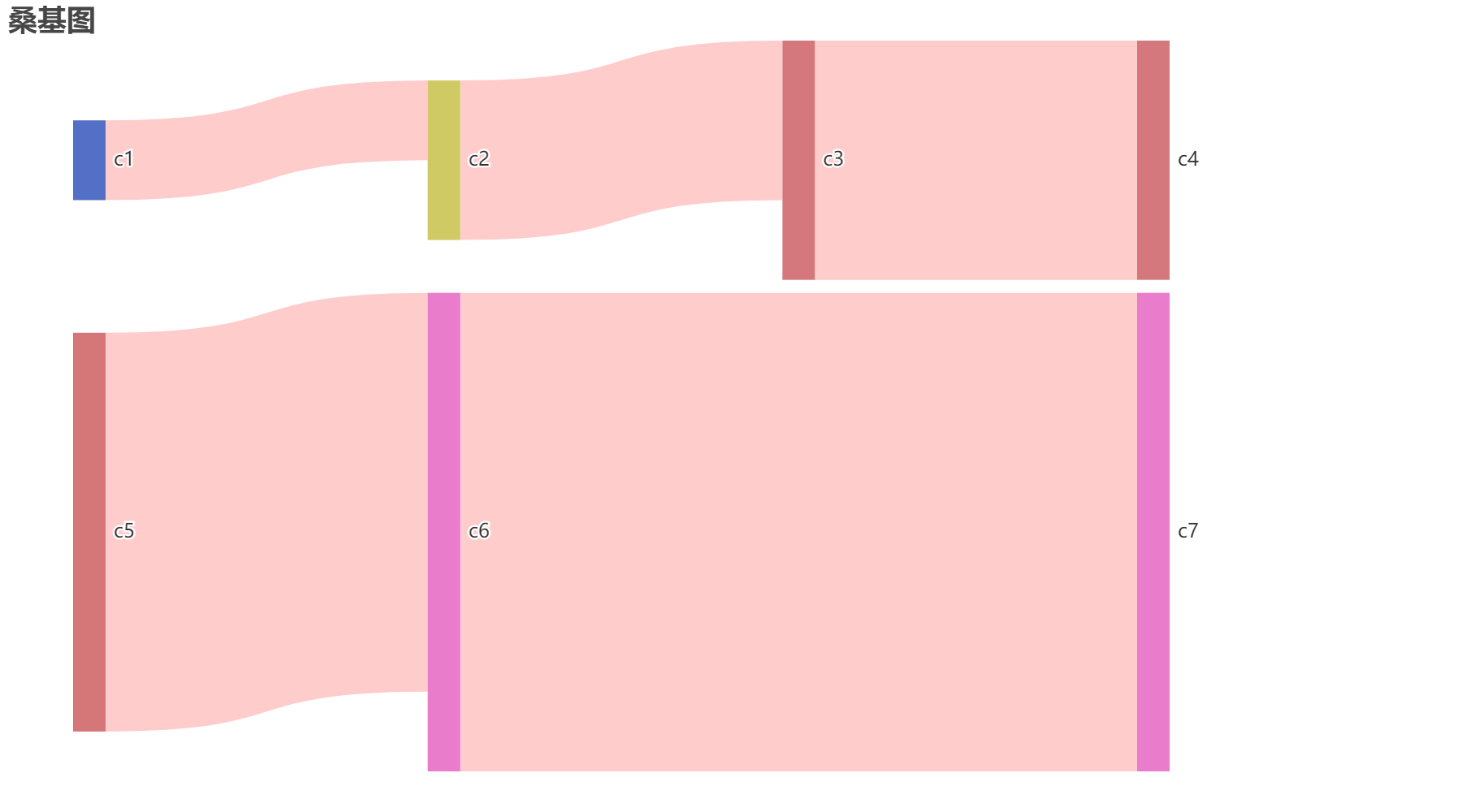
nodes = [
{'name':'c1'},
{'name':'c2'},
{'name':'c3'},
{'name':'c4'},
{'name':'c5'},
{'name':'c6'},
{'name':'c7'}
]
links=[
{'source':'c1','target':'c2','value':10},
{'source':'c2','target':'c3','value':20},
{'source':'c3','target':'c4','value':30},
{'source':'c5','target':'c6','value':50},
{'source':'c6','target':'c7','value':60},
]
1
2
3
4
5
6
7
8
9
10
11
12
13
14
15
16
c=(
    Sankey()
    .add(
        '',
        nodes,  #所有节点
        links,  #节点之间的链接关系
        linestyle_opt=opts.LineStyleOpts(
            opacity=0.2, #透明度
            curve=0.6,   #曲线幅度
            color='red'
        ),
        # label_opts=opts.LabelOpts(position='right')
    )
    .set_global_opts(title_opts=opts.TitleOpts(title='桑基图'))
)
c.render_notebook()